2025-2026
A new system for university education
Unify is an EdTech startup designed to make university guidance simpler, more human, and more accessible for students.
By bringing together everything students need to navigate their academic journey, from choosing a university and exploring degree programs to finding scholarships and other opportunities, Unify aims to become the go-to platform for students across Italy.


Here’s what I built:
Unify brings a large amount of diverse information into a single product. The challenge was to design a modular system that could handle this complexity while keeping the experience simple and accessible.
Clear hierarchies, consistent patterns and progressive disclosure helped us create an interface that feels comprehensive without being overwhelming, guiding students through complex decisions one step at a time.


What if everything students need was in one place?
The world university students have to navigate is vast and often overwhelming: choosing the right university, finding housing, managing tuition, accessing scholarships, connecting with mentors, and becoming part of a student community.
Today, these needs are fragmented across countless platforms and services. Unify’s mission is to bring them together in one ecosystem, helping students navigate university life and make more informed decisions.

Tools to help the students
One of Unify’s core features is a set of tools designed to guide students through key decisions. Help Me Find My Path builds on established frameworks such as RIASEC, adapting them to translate students’ interests and inclinations into relevant study paths. The Comparator then helps them evaluate universities and programs side by side.
Rather than reinventing existing methods, Unify connects and adapts them within one student-focused ecosystem.

When designing Unify from scratch, the first challenge was defining how users would navigate such a complex ecosystem. Together with the team, we identified the MVP’s core features and translated them into an initial information architecture and sitemap.
This first structure turned our assumptions into a testable experience, allowing us to identify friction points through usability tests and interviews and iterate based on real student behavior.


Our first attempt was far from being the right one.
We initially built the experience around a simple assumption: students are used to searching for everything. Google had shaped that behavior for years, and with AI making prompt-based interfaces increasingly familiar, putting a large search bar at the center of the experience felt like the natural choice. Open Unify, type what you need, find your way.
I followed the same logic with the visual identity. Bright colors, playful doodles, informal shapes: an attempt to build a language that could feel familiar and approachable to young students trying to figure out their future.
On paper, both choices made sense. But they were still assumptions. And once we put the product in front of real students, we started to see a different picture.

01 - INITIAL WIREFRAMES
One of the first wireframes. Big importance given to searchbar over the other elements.

02 - FIRST UI
This was Unify’s very first homepage: colorful, playful, and full of doodles.

03 - MANY SECTIONS
Initially, the homepage featured multiple cards competing at the same level of hierarchy
Testing and pain points
We tested the first MVP with 50 students, gathering valuable feedback and insights that directly informed the next iteration.

HIERARCHY
Students needed a clear hierarchy to understand where to start and how to move through the platform.

RELIABILITY
Students approached Unify as a tool for making an important decision about their future.

EXPLORATION
Students often arrived without knowing what they were looking for. They needed to explore their options before narrowing them down.

New user experience
User testing showed that Unify should not compete with AI or search engines. Students are not simply looking for answers: they need guidance to discover options and questions they may not even know they have.
This insight led us to replace the search bar with Unify’s two most distinctive tools: Help Me Find My Path and the Comparator. Instead of asking students what they want to search for, Unify now helps them understand where to start.

Help me find my path
The Help Me Find My Path feature required extensive iteration and testing to make its results as accurate and reliable as possible.
While we did not work directly with specialized experts, the team built the experience on established frameworks such as RIASEC, adapting them to Unify’s specific needs.
The tool offers different paths for high school students, undergraduate students, and users exploring potential career directions.
At the end of each questionnaire, users receive a personalized summary highlighting the university programs or career paths that best align with their profile.

01 - RIASEC
The RIASEC result is designed for students who are unsure about their future direction, helping them identify potential paths based on their interests and inclinations.

02 - BEST FIELDS OF WORK
For students who already know what to study, the tool helps identify the career paths that best match their profile.

03 - BEST FIELDS OF STUDY
For students unsure what to study, the tool helps explore different fields and their related career paths.
Mobile version:


Comparator
The Comparator is a key decision-making tool, allowing students to compare the most relevant aspects of universities and programs side by side.
The main challenge was identifying which information truly matters and how to present it, helping students make clearer decisions without adding unnecessary complexity.

01 - CHOOSE
Students can compare up to three universities or programs directly from the page.

02 - SIDE TO SIDE
An example of two programs being compared across key factors such as curriculum, duration, language, and tuition fees.

03 - QUICK SELECTION
Students can select up to three universities or programs while browsing, building their comparison without interrupting the exploration flow.
Mobile version:


A system built to scale:

Universities page
All pages follow a consistent structure: a hero section, search and filters, semantic areas, and the main content.

Programs page
Content across Unify is organized into semantic areas, creating a consistent information architecture across programs, universities, and career paths.
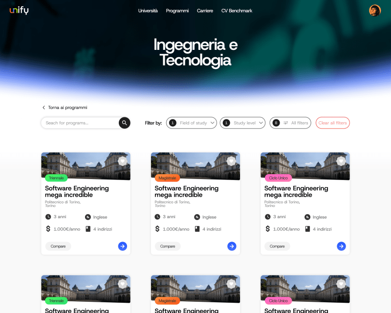
Programs within each area
Each semantic area has its own dedicated page, where programs are displayed as cards and can be searched and filtered to help students quickly explore and compare relevant options.

My lists page
Lists allow students to save and organize universities, programs, and careers in one place, making them easy to revisit and share.


Launched the MVP, we needed users.
During my final month at Unify, I transitioned from UX/UI Designer to Social Media Manager. With the MVP ready, the next challenge was no longer designing the product, but bringing people into it and building the initial traction needed for launch.


